Taken from the acclaimed Book:
*
We have looked at slide design in general but, to finish this chapter, I want to look more closely at what the main component of these slides should be. Pictures!
What really brought this home to me was a set of presentations I attended, two years ago, given by a group of statisticians. Although extremely professional, the presentations were a little dry. Like so many talks, there was information overload in the form of text, equations and diagrams that were neither very engaging nor easy to understand.
Then, half-way through the session, a woman got up, plugged in her laptop and a splash of colour filled the screen. It was like an impressionist painting – it may well have been an impressionist painting – and when it appeared, full-screen and without any text, someone in the audience exclaimed: ‘Woo!’
I thought, because the presenter was working in the area of data analytics, that this was some sort of software visualisation of a large data set. But it wasn’t, it was just her screensaver. A few seconds later the impressionist painting was replaced with a dull PowerPoint slideshow and the presentation began.
This story may not seem like much but it stayed with me. Firstly, the biggest reaction of the day was for a screensaver. That tells you something about the dullness of the slideshows you normally see. Secondly, it brought home to me that you cannot tell the eyes of audience members what to like. Your eye will be drawn to something before you become consciously aware of what it is. Why work against this perceptual predisposition? Your slides should be relevant to your topic, of course, but why can’t they be visually arresting as well?
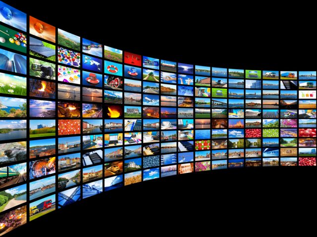
Many presentations contain no pictures and, in doing so, fail to utilise the real power of images which work on three levels. First, they grab attention, as the colourful screensaver did. Second, they aid comprehension which is the ‘thousand words’ idea we are all familiar with. And third, they are memorable. Sometimes an image will stay with you long after the content, or even the presenter, has been forgotten.

Even the most erudite broadsheet newspapers use images liberally.
The counter-argument to this is that a serious presentation is no place for gimmicky images. You are there to inform, not entertain. Wrong! Yes you are there to inform but the simplest way to do this is by working with the audience’s visual preferences, not against them.
There is nothing frivolous or gimmicky about the use of appropriate images. Even the most erudite broadsheet newspapers have 30-40% visual content, primarily images. There is nothing light or trivial about the news stories these papers feature, but for engagement, comprehension and memory, the images help. The same goes for online sources; glancing at the BBC website at the time of writing, there isn’t a single headline that is not accompanied by an image, and within each article there are an average of 4-5 further images or graphics.
Presenters sometimes worry about ‘overloading’ their audience with images but cognitively this is not a concern. From the moment you wake in the morning until the moment you close your eyes at night, you take in a ceaseless stream of video and audio information. Listening and seeing simultaneously is easy. Listening and reading, on the other hand, is impossible. Filling slides with bullet points doesn’t work.
It is so straightforward, nowadays, to put pictures into a presentation. You can either take these pictures yourself or search for them online. They should always be relevant to your talk, but there is enormous scope to bring a visual angle to your ideas. Even if the audience has seen what you are describing before, there is great merit in showing a clear image in relation to the new insights you are presenting. People will regard that image with new eyes when you tell them something fresh about it.

Just a pot of honey, from a presentation on honey.
I remember a very vivid example of the power of simple images in a presentation on the threat to the honey bee. There were full-screen, high-resolution images of bees gathering nectar from brightly coloured flowers and one picture which simply showed a pot of golden honey. The presenter even had a jar of honey on the table in front of him. The audience was fully engaged but everyone had (probably) seen honey before and tasted it. The subject matter was familiar but the audience was learning new insights and that made the familiar seem spellbinding. This presentation brought home to me how simple images and simple demonstrations can be so powerful, and certainly much better than a wall of text.
I could go on but I won’t. It’s very simple: visual aids should be visual.
Previous Page: < < What to Put on PowerPoint slides
Taken from the Book