**
I have three simple rules for what to put on PowerPoint slides.
1. Use images, not text.
2. Show one thing at a time.
3. Make items full-screen if possible.
Images not text. I have talked about this point, already. Text is not a visual aid. Period. But you may notice a contradiction here. I have used bullet points in the list above, and I would probably do the same thing if I were talking about this in a presentation. So there are times when a brief list of points can be useful, particularly to anchor a presentation.
You may return to this list periodically to show your progress through the presentation.
If you are doing this, though, try to make each item in the list readable in one visual fix. Many people are not aware of the fact that when you read a paragraph of text, your eye doesn’t scan smoothly across the page like a child running a finger under every word. Instead it jumps to two or three locations in the line and reads a cluster of words together. So if you can make the phrase just one eye-fix long, it will be more punchy. If bullet points run longer than this, many people won’t read them.
Bullet points are really just headings to talk around. The side-by-side examples below show a typical set of bullet points on the left and a much clearer, equally coherent set on the right.
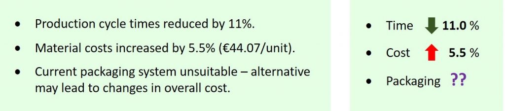
In the bullets on the left, you will notice how the key numbers get camouflaged by the text surrounding them, whereas on the right they stand clear. There is nearly always redundant text in bullet points and you should try to remove as much of this as possible.
The other thing I have done is to align the numbers and add a place of decimals to the first figure, 11.0%, to make it consistent with the second, 5.5%. This makes the numbers look more like what they mean, and again makes the conclusion stand out. The arrows accentuate the conclusions as does the addition of colour – green for improvement, red for worsening – to add a further layer of emphasis.
In an effort to make bullet points clearer, the tendency of presenters is to add more words but actually you are making them less clear by doing this. You are hiding the key point in a bramble of redundant text. You have to remember that what you say – with the added emphasis given by eye contact, hand gestures, facial expressions and a strong voice – will be far more powerful than what you write down. Only the key pieces of information should appear in the bullet points, the explanation of these can be achieved by the most important visual aid of all: you.
Show one thing at a time. Consider the slide below. This was taken from an actual presentation and although the words and images have been changed, the format is exactly as per the original.

This is not an extreme example for me to ridicule; this is typical. It came from a series of presentations I attended, and to put it into context I have shown (below) exact replica slides from the next two presentations in the same workshop. As you can observe, all are similarly dense and intricate.
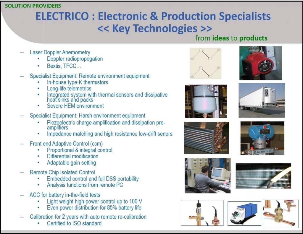

The first problem is that there is far too much content on all of these slides. For example, on the third slide, there are 67 words, 18 numbers and 8 images. That’s a total of 93 items. Each item represents a visual instruction: look at me. That’s 93 visual instructions! Each slide above was only one of three slides in a five-minute presentation, so in under two minutes, you are issuing 93 visual instructions which is a colossal over-reach. And, in fact, there are more than 93 pieces of content on this slide because when people see items side by side, or listed, or tabulated, they start to make comparisons and look for trends. This is really what tables and lists are supposed to prompt people to do; otherwise why group them at all? So there upwards of a hundred visual instructions on this one slide.
Information overload is not the only problem, though. Let us go back to the slide we first showed and examine the images. If we highlight one, in the bottom right-hand corner, and make a rough calculation of its area (which you can do with the on-screen ‘guides’ in PowerPoint) it can be seen to occupy just 1/51st of the total area of the slide. So it is effectively 51 times smaller than it could be.
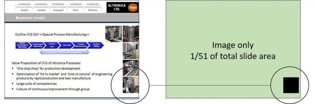
This has two implications. First – obviously – it is much harder to see than it needs to be. Second, nestled amongst many other elements, it is impossible for the viewer to know in what sequence to view it. By having just one item per slide, you are imposing a visual logic which can really clarify what you are saying.
In turn, within a given slide, you can use simple animations to make things appear, grow, grey-out or disappear in harmony with your verbal delivery. Used with restraint – and only to serve your message: no rounds-of-applause sound effects or bouncing word-swirls, please – these tools allow you to create clear, powerful visual arguments.
Whether you are animating a diagram within a slide, or showing a gallery of images across slides, try to make the images as large as possible and introduce them one-by-one.
Make images full-screen where possible. This follows on from the last point – one thing at a time – but goes a little further. Companies often insist on their employees using in-house templates when making a presentation. These have pre-defined spaces for inserting bullet points and sub-points, and perhaps a box for inserting an image or a graph. The slides also have a company logo and contact details, and possibly some background design or water-marked image to reinforce the brand. They don’t look too bad, generally, but when projected onto a screen, they kill the energy of the central image by telescoping it and surrounding it with scrappy decorations.
The side-by-side slides shown below demonstrate this point but don’t do it full justice; for that you would have to see the slides projected onto a large screen. In that setting, a high-resolution image – easily taken on your phone or obtained online – can look truly cinematic. It is crazy to curtail the potency of strong images, particularly when none of the other information on the slide is doing any communication work. As one of the guest lecturers on my courses, Paolo Carbone, says, ‘Having a company template on every slide is like handing the audience your business card and introducing yourself every two minutes.’ It’s unnecessary. Don’t do it.

Templates, borders, logos and unnecessary text on slides, apart from reducing the size of images, telescopes them and diminishes their impact.
You may, however, think comments like these are unhelpful. If your boss tells you to use the company template and I tell you otherwise, who wins the argument? Who’s paying your wages? Fair enough, but you can work around silly in-house directives like this quite easily.
You can still use the company template but make the image so large that it just so happens to run to edge of the slide and cover the template behind it. A little accident of formatting, you could call it. The point is, no one in the audience will notice what they haven’t seen, even your boss. A gallery of images is just that: a gallery of images. The audience will engage with those images as you are talking about them and that will be their sole focus. Likewise, if you showed them a demonstration, they would only be viewing what’s in your hand or what you pass around, and there’s no company template around that. So who cares if they don’t see the template on every slide; who even notices? Just be sure, that the template does appear on your introduction, conclusion and key signposting slides, and you’ll be fine.

The screen often dwarfs the presenter and although you should never let the slideshow take over, it provides an opportunity – slides and presenter together – for a spellbinding interactive show-and-tell.
Many companies actually go further and have a full set of slides which they demand their employees use. You are instructed to give the stock company presentation. This is a truly woeful idea. Wretched! A stock presentation, given by anyone, will be interesting to no one. It is no different from getting employees to learn, verbatim, a script for one-to-one meetings with clients. It stems from a desire to control the message and keep employees within bounds, and in this regard it works. The problem is, no one will listen to it.
This actually hits on a universal truth that I will return to several times in this book, which is this: communication is a creative process. There is no one sentence or definition or script you can read out that will magically implant your ideas directly into the minds of your listeners. The topic may be as old as the hills but the audience will vary and so will the context in which you are communicating it. Everyone is different and everyone has a different personality and a different set of experiences and stories to tell. The examples, analogies, demonstrations, and pictures you use (or more accurately, you should use) will vary with you, your audience, and with what is current. Electronics, medicine, economics, biology, business: the discussions around these and all other topics change by the month.
You can observe this in conversations. Often, a speaker will try to find the best way to communicate something. ‘How do I explain this? Let me see. Oh, yeah, think of it this way…’ We scurry about, mentally, in search of the most pertinent examples or analogies or stories or images that will make what we are saying clear. We seek to make connections from our mind to the mind of the listener, and these connections change with every new conversation.

Three visual examples to explain the concept of ‘entropy’ (see explanation below). However I saw none of these when I was studying engineering in college, only equations and diagrams.
As an example, above are three images I have used in lectures to explain entropy. Without getting bogged down on the concept, entropy can be thought of as the ‘quality’ of energy. We all know that energy is never created or destroyed, but as it changes from one form to another, it can lose quality.
The image on the left of a car braking is an example of this, as ordered movement-energy is changed to disordered heat-energy, which is basically jiggling atoms. The central image relates to the idea of order and disorder, which is another way of explaining entropy. The snooker table on the right is a more tangible idea of the order-disorder explanation although maybe I could swap this for a pool table if I were presenting to an American audience.
So although the concept of entropy is two hundred years old, the way you explain it changes with the context of the presentation and with time. There are a thousand ways to explain anything and you need always to be mindful of this and not just go with the first thing that comes into your head. You are not speaking to a room full of you. And just as the way you explain things changes with every new audience, so too will the slides you use. An inflexible stock company presentation, therefore, is a disaster. Don’t use one.
Continue Article: Pictures in PowerPoint
Previous Page: << Reading Off The Bullets in PowerPoint
*
Taken from the Book Awful Presentations which is filled with much much more first-class advice for making your presentations really engaging.