Taken from the Book Awful Presentations which is filled with much much more first-class advice for making your presentations really engaging.
*
Reading off the Slides | The Problem
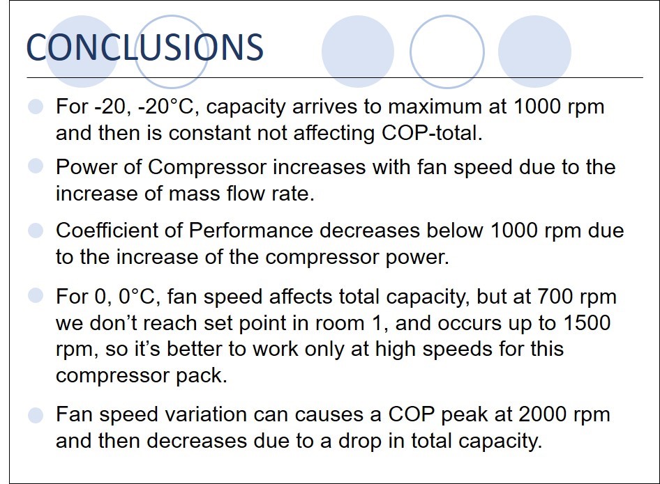
I could show you many examples but do I really need to? We have all experienced this problem, probably hundreds of times. People fill slide after slide with bullet points and then read them out, one by one. You know you’re in trouble when you catch a glimpse of the slide-sorter at the start of the presentation, and it looks like an aerial view of the American Great Plains: lots of dull-coloured rectangles, each intricately lined. Not only does it resemble ploughed prairie, it is about as interesting.
 The all too familiar text-laden, bullet point slide.
This is bad for the audience – who wants to read text, or have it read to them(?) – but it is worse for the presenter because he or she gets sucked into gawping at their own slides to remember what they were going to say. And it’s actually even worse than this because a bullet point-driven presentation is indicative of an encyclopaedic approach – point; sub-point; sub-sub-point – which is totally unsuitable for a short, transient, audio-visual communication. And, apart from being ineffective, it is also a missed opportunity to use more visual content that will excite curiosity and make your points easier to understand and memorable. It’s a bad idea all round.
The Reason
The million dollar question is why on earth do people do this? Repeatedly. If you look for a precedent in popular culture you won’t find one. The only time text is overlaid with someone talking is when subtitles are used in films and this is only done when the audience doesn’t speak the language of the film (obviously). Subtitles are typically made as unobtrusive as possible so as not to detract from the interesting pictures that the audience actually wishes to see.
If you search the education and psychology literature, again you won’t find evidence that on-screen text aids verbal delivery. In fact, the field of Cognitive Load Theory throws up many studies that say the exact opposite: text is distracting, not enhancing, and certainly not appealing. But it doesn’t take a rocket scientist or a cognitive psychologist to work this out. Try reading a book and having a conversation at the same time; it can’t be done.
In my experience there are three reasons why people persist in filling slides with bullet points. None are good reasons, but because presentations are so presenter-centred – with presenters worrying far more about what they are saying than what the audience is hearing – these three factors dominate thinking during the preparation phase.
Firstly, bullet points act as a prompt for the presenter. This is helpful to the speaker but not the audience. Why would they want to see the speaker’s guide notes? Also it leads the presenter into a damaging cycle. The more text you put on the screen, the more you need to read that text to remind you what you put there in the first place. The act of having a prompt begets the need for one, if you think about it.

The more you put on the screen, the more you have to look at the screen to remember what you put there.
The most extreme example of this I have encountered was a philosophy PhD student who, at conferences, favoured reading his paper out, word for word. This is actually the norm in many of the humanities disciplines. He told me that his argument was so intricate and required such precise explanation, that he had to write it down in a very ordered way or he would lose his train of thought. The obvious counter-argument to this is that if he needed such a precisely crafted script to allow him, the expert, to follow his own argument, then what chance had the audience got of following it?
The second reason for bullet points is that people plan their presentations in PowerPoint. Often I hear presenters say things like, ‘Well, I have ten minutes, so that’s ten slides: three on company background, one each on our five products, and two to wrap up.’ This approach can only result in a brain-dump of bullets and not a well-structured presentation.
To be honest, I can understand why it happens. A presentation is like an exam: you prepare and worry about it for maybe weeks on end, but the second before you start to speak – just like the second before you turn over an exam paper – you still have nothing to show for your efforts. Everything may yet go wrong. No matter how many times you run through the presentation in your head, those words keep sliding around mercurially and coming out differently. The worry is that when you get up to speak, they won’t come out at all. By writing these words down on slides, you’re latching them in place. Now you can be sure that the presentation will progress in a precise order which is greatly reassuring. The only downside is, your presentation will be awful.
The third reason for this hail of bullets is the increasing tendency for companies to use PowerPoint ‘slide decks’ – a term I abhor, by the way – as documents. ‘Email me the PowerPoint,’ is an expression you often hear and suggests that the presentation should work nearly as well without the presenter. The irony being that the ‘slide deck’ is usually the least interesting part of that presentation.
So if you look at these three reasons for bullet points you’ll realise that they perform functions before, during, and after the presentation. Before the presentation, PowerPoint is a plan; during the presentation it is a prompt; afterwards it is a document. But although these are valuable aids to the presenter, none benefit the audience. And you could probably throw in a fourth reason why people fill their slides with text: they see other people doing it! Which, as hopefully this book will show, is the worst reason of all.
The Solution
The solution is simple:
1. Get rid of the text, or nearly all of it
2. Figure out how to overcome the challenges – planning, prompting, documenting – that bullet points are normally used for.
3. Find something good to put on the slides instead. We’ll come to that.
1. Decluttering
Getting rid of the text is not difficult and although it may be traumatic, like decluttering your kitchen, it will be a weight off your mind. Delete all the text. In fact, delete the entire file, close PowerPoint and take out a blank sheet of paper. This is where you begin the planning process.
2. Planning, Prompting, Documenting
Next write down an aim for your presentation in one sentence. This is where the presentation will take your audience and this will be your conclusion. Think of the presentation as the justification of this conclusion. Let’s say you have spent four months working on a project, then your conclusion might be:
Recommendation for future direction of project…
or
Get agreement/decision on…
or
Prompt audience to ask questions about…
Then you can build the content around this end point. We will look more closely at how you do this in chapter 4 on structure, but for now take it that having a clear plan makes the choice of relevant visual aids much easier. The key thing is to separate your plan from your slideshow. The slideshow should be like a salesman’s carpet-bag of samples which you dip into when you need something to help you make a point.
Now you have a plan, what should you use as a prompt to keep you on track during the presentation? Creating helpful guide notes can be tricky because if there is too much written on the sheet, you won’t be able to pick up where you left off; but if you have too little written there, the instructions might, in the heat of the moment, be enigmatically brief.
‘Next steps.’ What steps?
‘Show example.’ Example of what?
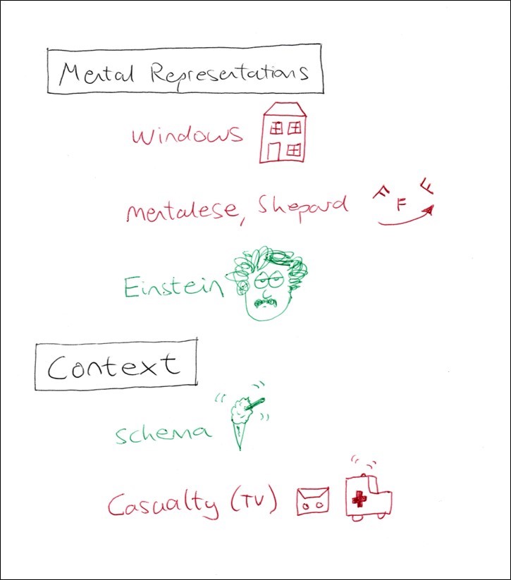
The best solution I have found to this problem is to make your notes as visual as possible. An example from one of my own talks is presented below and you can see that along with the one- or two-word cues, there are images, symbols and different colours to distinguish different types of content: red for demonstration, black for slides, green for examples, etc.

Pictures, particularly ones you drew yourself, are an excellent prompt because their meaning is more concise and immediate than a string of words. The above prompt sheet is from one of my own presentations.
There remains the question of handouts. What do you leave the audience with after the presentation?
It is difficult to form a coherent record of a short fleeting presentation and I have come to realise that the audience will tie many of their memories to the visuals you showed them. You will notice this in the Q&A at the end where there will be questions like, ‘Remember the diagram you showed with the orange arrows on it…’ or, ‘Can you return to the photo of the building, the one with the flags in front…’
So, your actual slideshow is a useful memory hook for the people who witnessed it, but it doesn’t stand on its own as a document. Which is a problem, as your presentation can take on a life of its own after you have given it. If you have presented to a client and presented well, then the recipient of that presentation will often relay the key messages to other people in their organisation. ‘That guy who came in to us last week was very interesting, I’ll dig out his slides.’ So it makes sense to give your audience something coherent to bring to the next stage. But what?
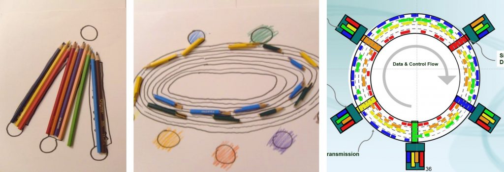
A friend of mine, John Dunne, who started his own company in digital telecoms, faced this same problem. John is a superb presenter and revealed a slideshow he created on a very un-straightforward concept called ‘optical packet switching’. For this, he used chopped up pieces of colouring pencil, a hand-drawn sketch of a ring network and a step-by-step slide animation that brought a very complex concept to life in an accessible way. The audience loved John’s presentation, but with only drawings and no text, how could they use this creative slideshow in follow-on meetings with co-workers, to relay what they had heard?

These samples are from a creative slideshow on ‘optical packet switching’. Left and centre are animated slides made from photographs of pieces of colouring pencil, and on the right is the video animation this description builds towards.
‘The problem,’ said John, ‘is that the people you present to will use that presentation internally to sell after you’ve gone. So the temptation is to put essay-like information into the presentation so that it becomes a reference document. But of course that is completely counterproductive on the day.’
‘So, what did you do?’ I asked him.
‘We started by having two presentations, and we would add notes to one. But very often, when the notes were passed on, the guy who read the presentation didn’t read the notes, or didn’t tell their colleagues that the notes were there. In the end, we came up with a simpler solution. We’d mix information slides with picture slides and skip the information slides on the day. But we would give the customer a glimpse that they were there. It provided the comfort that, tomorrow, they wouldn’t need to explain the diagram themselves.’
Simple and effective. And it’s interesting that John saw the overall problem as about creating notes, not a problem with creating slides. The visual-ness of the slides was never compromised. There is no point having great notes if you have lousy slides because the presentation won’t enthuse people enough to look at those notes afterwards.
Continue Article: What to Put On PowerPoint Slides
*
Taken from the Book Awful Presentations which is filled with much much more first-class advice for making your presentations really engaging.


